Design a responsive site for Pandia Health’s patient portal.

Current vs. Proposed
Design sprint
Tasks: heuristics evaluation, user flows, sitemap, responsive design, wireframes, prototype, and usability testing.
Pandia’s mission is to deliver peace of mind
Their mission goes beyond being a contraceptive delivery service, with the goal to make birth control accessible to whoever needed it. Being a leader in this market for the past 6 years, Pandia strives to grow its connection with their patient base, through live customer service, clear ordering, easy editing, and self-service articles.

“What is more convenient than having birth control arrive in a discrete package every month? Not much.”
Problem
Most of their customers have been with them since the company’s inception, but Pandia has noticed a significant drop in patient retention over the past 6 months. They’ve conducted preliminary research and have a strategy to heighten Pandia’s product offerings and services. They have asked our team to consult on a 3-week sprint to:
Create design concepts that align with their overall strategy
Conduct surveys and interviews to uncover pain points
Develop web and app for iOS or Android
Ideate self-help services to alleviate the customer service team
As much research as you can fit at the top of the funnel
My design process weighs heavily on validating solutions through testing rather than assumptions. Since this was a 3-week sprint, a variety of testing methods were used to start painting a picture; from comparative and competitive analysis, heuristic analysis, surveys, interviews, and usability testing. Some tasks were:
Compared to other companies with similar users and offerings. (Hims/Hers and Hello Alpha)
Surfaced key findings from surveys pertaining to log-in and portal layout
Uncovered 3 main workflows, that were later used for usability testing
Heuristic analysis (mobile)
Best mobile practices we propose to update:
The hamburger menu is not consistent across pages
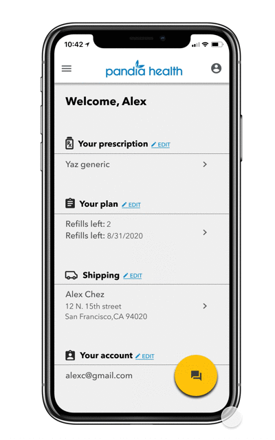
Patients’ account information is not clickable, only able to edit in “My Profile”
Useful links are hidden in secondary pages, (Contact Us and FAQ’s)

Heuristic analysis
Best practices for a cohesive mobile/web design:
Have similar navigation; be careful moving main actions into the hamburger menu
Have consistent icons; messaging icons

Testing workflows
10 participants were asked to complete 3 tasks on the current website, then the same 3 tasks on the mobile app.
Can you locate the Frequently Asked Questions section and see if any titles pertain to your questions? If not, are there other places you can navigate to look for help?
You receive a text from Pandia Health that your prescriptions are shipping in a week. You are not currently living where it is shipping. Could you show me where you would navigate to change your shipping address?
Your prescription was shipped and you want to check its delivery progress. Where would you navigate to find this?
The results are in

Proposed direction
Design a multiple-page structure for workflows on mobile
Use the same elements for web in a table structure
Change the location of duplicate occurrences
Iterate sitemap and layout based on survey findings
Information architecture
The proposed decisions I made in the sitemap to create ease of workflow in mobile as well as desktop.


Usability testing
Developing skeleton mockups into hi-fidelity mockups helped testers and stakeholders see how elements would react and share similarities.

Next steps
Explore branding; content, customer service live, and bot
More market research on retention
Engineering efforts in creating apps for iOS and Android